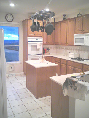
I had a client who didn't really have the budget or quite frankly want to have the budget (doesn't like to cook or be in her kitchen) to replace her existing, as she would say "UGLY", oak kitchen cabinets.
I suggested we paint them and with a few other changes like the countertop, flooring and backsplash, the mission was complete and she was ECSTATIC at the outcome...Now that isn't to say she is in there cooking still but at least when she sees it she loves it!
It's hard to tell in these pictures but I wanted to bring to your attention a detail I like to add whenever possible to existing kitchen islands. I like to add moldings and change the color of islands to make them look more substantial than some can be.
My client added the red glass pieces at the top of her cabinets because we added ambiance lights up there and she wanted to show them off.
She didn't want to replace any of her appliances other than her "hog of space" refrigerator, which we did with a counter depth, Can you see the difference in these photos other than the new one is prettier?

She didn't like the functionality of her existing pantry so we changed it.
Now all of her cabinets open to pull out drawers to accommodate her needs. Oh, and she now has a small beverage fridge for her hubby's beer too.
So how do you like this kitchen remodel, do you think the cabinets are an improvement?


10 comments:
I love the cabinets and the new countertops. I'm so glad you got rid of the functionality of the former kitchen. I'm glad you got rid of all the pots hanging from the ceiling. They are just dust-catchers and ugly unless you are an reincarnation of Julia Child. One negative criticism: Her husband's beer fridge should go...not good for his figure :).
Wow - the kitchen looks much better. I like what you did with the countertops and cabinets. Hard to see the floor. I especially love what you did with the pantry! So fancy and so functional! I think it makes the room look bigger. The fridge is nice but it's funny to update the fridge and not the cooktop or ovens, no? Now they don't match. And I honestly don't like the red glass pieces...
Thank you for your comments, I should've stressed more about my clients budget and how much she hates kitchens....I didn't have the money or her approval to replace her white appliances and quite frankly it really works in person with the SS fridge on the other side.
Yeah about those glass pieces....My client loves them, she collects them and that is that sometimes. ;))))))
Hard to imagine hating kitchens! I didn't mean to criticize about the mis-matched appliances. Just wonder if I would have made the same choice instead of a white counter-depth fridge. I imagine that fitting in what clients love (like those red glass pieces) can be the hardest part!
No worries, I just wanted to stress that in a perfect world they would've been out there is all. ;) The client didn't want a huge, white fridge and since our cabinets were grey it seemed like the SS was the best way to go.
You are soooo right about that last part too! ;)
Great job! I absolutely LOVE what you did with the island (you've got me looking at my own island differently now!).
I can relate about not liking kitchens...in my first house, I didn't cook at all...actually had to dust the countertops, but I still wanted it to look nice. Now? Well, I have to cook now. :)
I think you did a terrific job. As an interior designer myself, I understand the limitations of the client's budget and their likes/dislikes. I always ask the question "Can I make it better?" Honestly, I think you made this kitchen SOOOOO much better---so you did your job beautifully. At the end of the day, your client is the one who has to love it and want to live there. I'm sure she's thrilled! Great job.
I like the cabinets and you added molding as well, which I always thinks makes a big difference. I love the countertop and the island painted black. I do like the island a different color than the other cabinets in a kitchen, too. Well, if nothing else, at least she can sit at the counter and enjoy the view!
Marie great job!! I know how hard it is to work with clients on limited budgets. We just can't do all that we want to do. Love the island too
Great improvement.
Question on the cabinets. Did you leave the original finish? What exactly did you do to the cabinets, I really love them. I have oak cabinets and they need that update.
Post a Comment